Relic, the feature debut from Australian director Natalie Erika James, has drawn rave reviews in the wake of its world premiere at this year’s Sundance Film Festival for its haunting tale of a daughter, a mother and a grandmother dealing with the latter’s dementia. When the elderly Edna (Robin Nevin) goes missing, daughter Kay (Emily Mortimer) and granddaughter Sam (Bella Heathcote) travel to their remote family home to look for her, only to discover that a sinister force is haunting the house.
For colorist CJ Dobson, CSI, who was involved in the project from pre-production camera tests and LUT creation through dailies and final grading, collaborating with James on the genre-bending film was both thrilling and uniquely challenging. “I really enjoyed being a part of the team for Relic, not just because I had beautiful images to work with, but also because I really believe in the message of the film which Natalie chose to tell in a very scary, yet sympathetic way,” she says. “It draws on her personal experience with her grandmother’s Alzheimer’s to tell an honest, human story within the context of a horror film.”

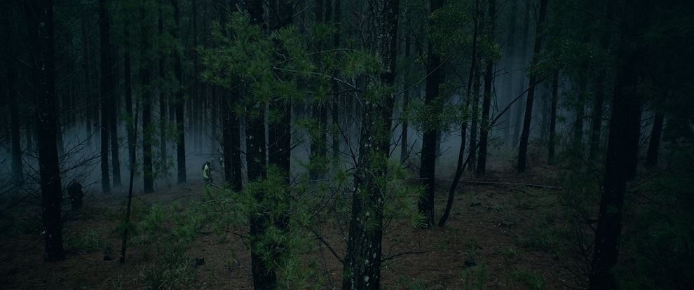
A Melbourne-based freelancer, Dobson worked with James and cinematographer Charlie Sarroff to craft a look that delicately walks a line between dramatic realism and familiar haunted house film tropes. “During the initial stages of production the DOP Charlie and I sat together to generate a set of LUTs which were used on set and applied to the dailies,” she recalls. “Keeping light levels down, colours muted and applying subtle hints of blue and green, we created a dark, deep and moody feel.
“Having already established the ‘look’, meant we saved time during the final stages of the grade. So it was really polishing, adding shape, highlighting areas of the frame where we wanted the audience to look (or not look) and occasionally adjusting our ‘look’ when the story required a different feel.”

“We had a lot of conversations about how dark to go,” she adds. “We wanted to retain most of the detail but decided to let some things fade into the darkness to add suspense. We then came back and applied a different treatment for the TV pass to compensate for users at-home viewing conditions, but we didn’t go so far as to lose the feel we had worked so hard to achieve for the cinematic version. Ultimately, the best experience for viewers is going to be in a dark room. Lights off people!”
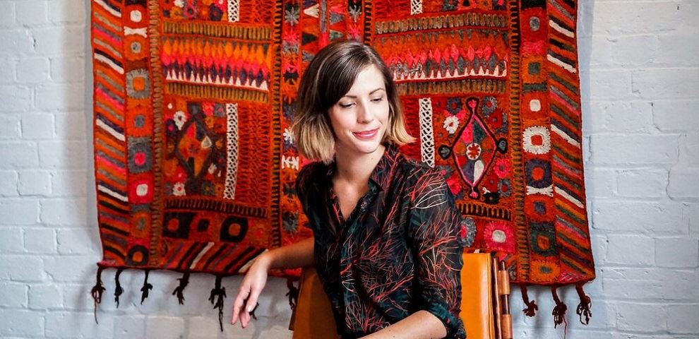
Dobson began her career in Wellington, New Zealand as an editor, compositor and colorist. Ultimately electing to focus on color, she joined Digital Pictures, Melbourne, in 2010. A few years later, she became an independent. Her credits span commercials, episodic television, documentaries and features, the latter including Tanna, a 2017 Oscar nominee for Best Foreign Film.
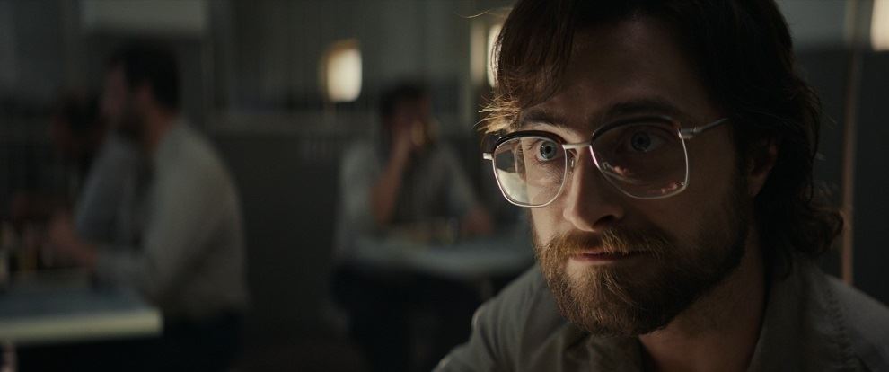
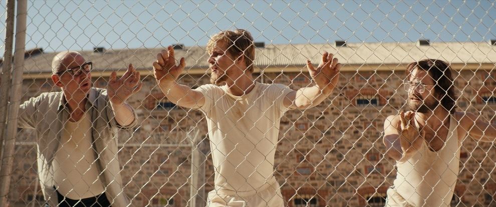
Other recent projects include the just-released drama Escape From Pretoria from director Francis Annan and Arclight Films. Starring Daniel Radcliffe, it is the true-life story of two political prisoners who make a daring escape from a penitentiary in apartheid-era South Africa. Dobson worked directly with Annan and cinematographer Geoffrey Hall ACS in finalizing the look. "The grade was set up with a cinematic yet natural feel,” she recalls. “We wanted the audience to believe this was all taking place during apartheid South Africa without going down the path of applying a cliché ’70s filter’ across the film. Francis had originally hoped to shoot film for aesthetic reasons but in the end the project was shot digital so I used some techniques to deepen colors which gave the image depth without having to push the contrast too far. There was already beautiful contrast and shape within the lighting, so much of the grade was spent enhancing narrative cues and applying the look and feel across every scene.”

“Exterior day time scenes were given a bright hot look to contrast the darker scenes within the prison,” she adds. “We wanted the bright blue skies and green trees (just visible beyond the prison walls) to contrast the dark and muted tones of the prisons interior."
A relatively new member of CSI, Dobson joined the organization to have closer contact with other colorists and to share ideas and techniques. She also wants to help raise the profile of her chosen profession. “People aren’t aware of the importance of color,” she says. “I’m an advocate for color and excited to be part of an organization that is getting the message out.”

To learn more about CJ Dobson, check out her interview with Robusty and her website cjdobson.com.
